
What to Put on a Business Card in 2026 (and What to Leave Off)
The complete checklist for what to put on a business card — five essentials, the modern optional layer, an honest leave-off list, and what digital cards change about all of it.
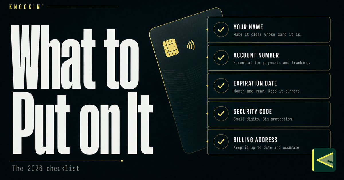
Printed or digital, a business card has one job: hand a stranger the smallest set of facts they need to act on having met you — and not one fact more. Most cards fail in one of two directions. They are either too sparse, leaving the reader to guess what to do next, or too crowded, so that nothing on the card rises above the noise. The fix in both cases is the same: a checklist, applied honestly.
Here is the whole answer up front. Every business card needs five things: your name, one title, your company or personal brand, one contact method you actually answer, and one clear next step. Around those five sits a modern optional layer — a QR code, social handles, a portfolio link, a calendar link — and each of those earns its place only when it does a job. Meanwhile, a surprising share of what people still print belongs in the bin: stacked titles, three phone numbers, backgrounds that fight the text. The rest of this guide walks through every one of those decisions, for paper cards and digital ones, because the checklist is mostly shared and the differences are where things get interesting.
The Five Essentials
Start with these five and the card already works, whatever it is printed on. Each one earns its slot by answering a single question the reader is silently asking.
1. Your Name — the One People Should Use
Put the name you want to be called by, not necessarily the one on your legal documents. If you are Michael to the government and Mike to every client you have ever closed, the card says Mike. If you use a middle initial professionally, keep it; if nobody has ever called you by your middle name, drop it. A nickname in quotation marks works when the nickname is genuinely how your industry knows you, and reads as try-hard when it is not.
The name is also your anchor of visual weight. On a card with sane hierarchy, the name is the largest or second-largest element on it. If your logo is three times the size of your name, you have made the card about the company and left the person unreadable — fine for a company everyone already knows, wrong for the rest of us.
2. One Title That Explains What You Do
The title field answers one question: what does this person actually do? Write it for the reader, not for your org chart. "Founder" alone tells a stranger almost nothing — founder of what, doing what? "Founder, Stitchline Studio" is better; "Founder, Stitchline Studio — knitwear design for independent labels" is a card that explains itself in one line.
If your official title is internal jargon — "Director of Revenue Operations" — keep it and add a plain-language line underneath, or replace it with the plain-language version entirely. The test is simple: could a smart person outside your industry repeat what you do after a two-second glance? If not, the title is doing HR's job instead of yours.
3. Your Company or Personal Brand
The third essential is who you represent: a company name and logo, or — if you work for yourself — your personal brand, which may simply be your name set as a wordmark. What matters is consistency. The name, the handle and the logo on the card should match what someone finds when they search for you afterwards. A card that says one handle while the profile behind its QR code says another has quietly cost you the follow.
One honest note for solo workers: if your "brand" is a logo you made in an evening and a name nobody searches for, your own name is the stronger brand. Put it in the logo slot, spend the design effort on legibility, and revisit the brand once it has something behind it.
4. Contact Details — One Per Channel, the One You Answer
This is where most cards overdose. The rule: one phone number and one email, the channels you actually monitor. A direct line beats a switchboard. An email that reaches you beats an info@ address that reaches a queue you read on Fridays. If your industry genuinely runs on a messaging app — WhatsApp across much of Europe and Latin America, WeChat in China, LINE in Japan, Telegram in some freelance and crypto circles — that handle counts as an essential in its own right [Source: https://www.hihello.com/blog/what-information-to-put-on-a-business-card].
On a printed card, contact details are strings of text the reader has to retype. On a digital card they should be buttons — tap to call, tap to mail, tap to save. The checklist item is identical; the mechanics differ, and the digital version removes the typing step where follow-ups quietly die.
5. One Clear Next Step
The most-skipped essential, and the one that separates a card from a label. After someone reads the four items above, what should they do? "Contact me" is not an answer — it is a category. A next step is specific: book a fifteen-minute intro call, scan for the portfolio, read the case studies, connect on LinkedIn. One primary action, visually distinct — not three competing ones.
Printed cards have traditionally smuggled the next step into the company website. That works only if the website is built to receive strangers, and most home pages are not. A QR code that opens a page starting the relationship properly, or a calendar link on a digital card, does the job with far less friction.
The Modern Optional Layer
These four additions are where a 2026 card pulls ahead of a 1996 one. None is mandatory. Each has a specific job, and each should be cut without sentiment when it stops doing that job.
A QR code is the bridge between paper and everything else. Print one on the card and the static object gains a live layer: scan it, and the stranger lands on your current profile instead of the facts as they stood at print time. Two rules keep it honest — the code must open a page built for phones, since a desktop-only PDF is a dead end on a camera screen, and it must resolve to something you can update rather than a frozen file. Placement, sizing and the common mistakes all get their own treatment in the digital business card QR code guide. The code itself is older than most of its users assume: Denso Wave invented it in 1994 for tracking car parts [Source: https://www.denso-wave.com/en/adcd/products/about-qrcode/].
Social handles come next, with a hard filter: only the accounts you keep alive, and only where your audience actually is. One strong LinkedIn for B2B work, one Instagram for visual work, one YouTube or X if that is where you publish. Four icons for accounts you last posted from in 2023 are worse than no icons — they are four small promises you are visibly breaking.
A portfolio link is the single best addition for anyone whose work can be seen. One link, chosen work, not the full archive. The card opens the door; the portfolio is the room people came to see.
A calendar link is the strongest next step ever put on a card. Booking a meeting used to require an email thread and three rounds of timezone arithmetic; now the stranger who gets interested at eleven at night can book Tuesday before the interest cools. If you add only one thing from this layer, add this one.
What to Leave Off: The Honest List
Subtraction is where most cards improve the most. Nothing on this list is scandalous. All of it is common.
Stacked titles. "Founder & CEO & CFO & Head of Growth" does not read as impressive; it reads as a one-person company wearing four badges — and it makes the reader do the work of figuring out which of the four they should talk to. Keep one title. Put the rest in the live profile the QR code leads to.
Multiple numbers and addresses. Two phone numbers means neither is truly yours. Two emails means the reader has to guess which to use. A full street address, unless clients visit your office or your industry expects one, is inherited habit taking up the most expensive square centimeters you own.
Decoration that fights the text. Dark, busy backgrounds under low-contrast type, script fonts that dissolve at print size, ink-heavy patterns behind a ten-point phone number — every one of these trades legibility for mood, and legibility is the entire product. A card a stranger cannot read in two seconds has failed at its only job, however it photographs.
Time-sensitive facts on paper. Prices, "now hiring", event dates, a role you might leave next quarter. On a printed card each of these is a countdown to being wrong, and wrong cards get discarded faster than plain ones. Anything that expires belongs on the live side of the QR code, where you can change it tonight.
The ghosts: fax numbers, retired logos, QR codes that resolve to a page nobody ever built, the toll-free number from a previous business. If you cannot keep it current, cut it.
Layout Basics: Hierarchy and Whitespace
You do not need a design degree. You need two habits.
Hierarchy means size signals importance. Decide the reading order — name, what you do, how to reach you, what to do next — and let type size fall accordingly. Two font sizes and a bold weight will carry almost any card. Whitespace is not wasted space; on the standard US card of 3.5 × 2 inches [Source: https://www.hihello.com/blog/what-information-to-put-on-a-business-card] — roughly credit-card sized; the international card standard is 85.6 × 53.98 mm [Source: https://en.wikipedia.org/wiki/ISO/IEC_7810] — margins are what let the eye find the five essentials instead of hunting for them.
That is the whole craft for most purposes: five essentials, one next step, and room to breathe.
What Digital Cards Change About the Checklist
Everything above applies to paper and digital alike. A digital card — a live profile shared by link, QR, NFC or wallet pass rather than a printed object — changes two things about what you can afford to put on it. If the category is new to you, we keep a full explainer at what is a digital business card.
The first change is that mistakes stop being permanent. On paper, every field is a bet: print five hundred cards with a typo, change roles, move cities, and the box in the drawer becomes landfill you paid for. On a digital card the profile is the card, and updating it updates every QR code, link and wallet pass already in circulation. The mechanics of that propagation are worth understanding before you rely on them — we walk through them in how digital business cards work. Practically, this redraws the leave-off list: time-sensitive facts, seasonal offers and every "currently" statement stop being risks and become ordinary content, because wrong this morning means corrected tonight, everywhere at once.
The second change is newer: the card can carry a conversational layer. An AI card holds a knowledge base built from your own work and answers the questions a stranger would otherwise have to email you — what do you actually do, do you work with clients like me, what does an engagement roughly look like, when are you next free. It answers from facts you control, in your voice, and it hands over anything that needs judgment instead of improvising an answer. We treat that layer in depth in the AI business card guide. The checklist consequence is simple: when the card can answer questions, the card itself gets shorter. The five essentials plus a door — and the conversation carries the rest.
Tuning the Card to Your Role
The checklist is shared. The emphasis is not.
Founders: your card's hardest reader is the one who finds it at midnight with no context. Make the one-line explanation of the company the title field's job, make the next step a meeting rather than a homepage, and put the deeper facts in the live layer where they can be asked about rather than crammed on. A card that survives a midnight read beats one that only works while you are standing there.
Sales and business development: you hand out cards at volume, so mechanics matter as much as content — a QR code that saves straight to contacts, and a calendar link so the next step happens while the conversation is still warm. Keep the title plain about what you sell; "enterprise software, mid-market, East region" starts more conversations than an internal grade like "Senior Account Executive II". And keep the direct line truly direct.
Creators: your name is the brand and the work is the proof, so the portfolio link outranks every other optional item, and the next step should feed the work — subscribe, watch, read — rather than a generic "connect". Your card's job is not to summarize you. It is to start curiosity and point it at the thing you made.
Conclusion
The checklist, one last time: your name, one title that explains itself, your company or personal brand, one contact method you actually answer, and one clear next step. Then the optional layer — QR code, social handles, portfolio, calendar — only where it earns the space, and an honest pass of subtraction over everything else. Paper or digital, that is what to put on a business card in 2026.
The deeper principle the checklist serves: a card is judged not by how it looks at the handshake but by what happens after. If you want a card whose next step is a conversation — one that answers in your voice while you are elsewhere and hands back the judgment calls — you can build one at Knockin, free to start, no credit card, set up in minutes. The step-by-step walkthrough shows how, and the story of why we built it explains the rest.
Related Posts
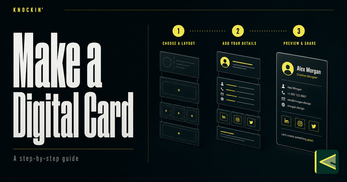
How to Make a Digital Business Card (Step by Step, 2026)
A practical, tool-agnostic guide to making a digital business card: decide content first, choose a maker on five criteria, build from a…
Business Card QR Codes: How They Work, Design Rules, and Sizing
The complete reference for QR codes on business cards: how they work, static vs dynamic, how to generate one that lasts, and the exact…
What Is a Digital Business Card: The Card That Answers Back
A live profile shared by link, QR, or NFC — and AI now turns static cards into ones that answer and hand off judgment calls. Here's how the…
Frequently Asked Questions
What are the five essentials every business card needs?
Should I put a QR code on my business card?
What should you NOT put on a business card?
Does the checklist change for a digital business card?
Your bio can finally answer back
Turn what you already know into an intelligent bio card that answers when you're not there.
Build, refine, and share in minutes — no credit card required.
https://knockin.info/blog/what-to-put-on-a-business-card