
Why Knockin Is a Door: Design Decisions Behind a Bio That Answers
Why Knockin looks the way it does — a founder's case for the name, the K, the deep-green paint, and the mosaics behind a bio that answers back.
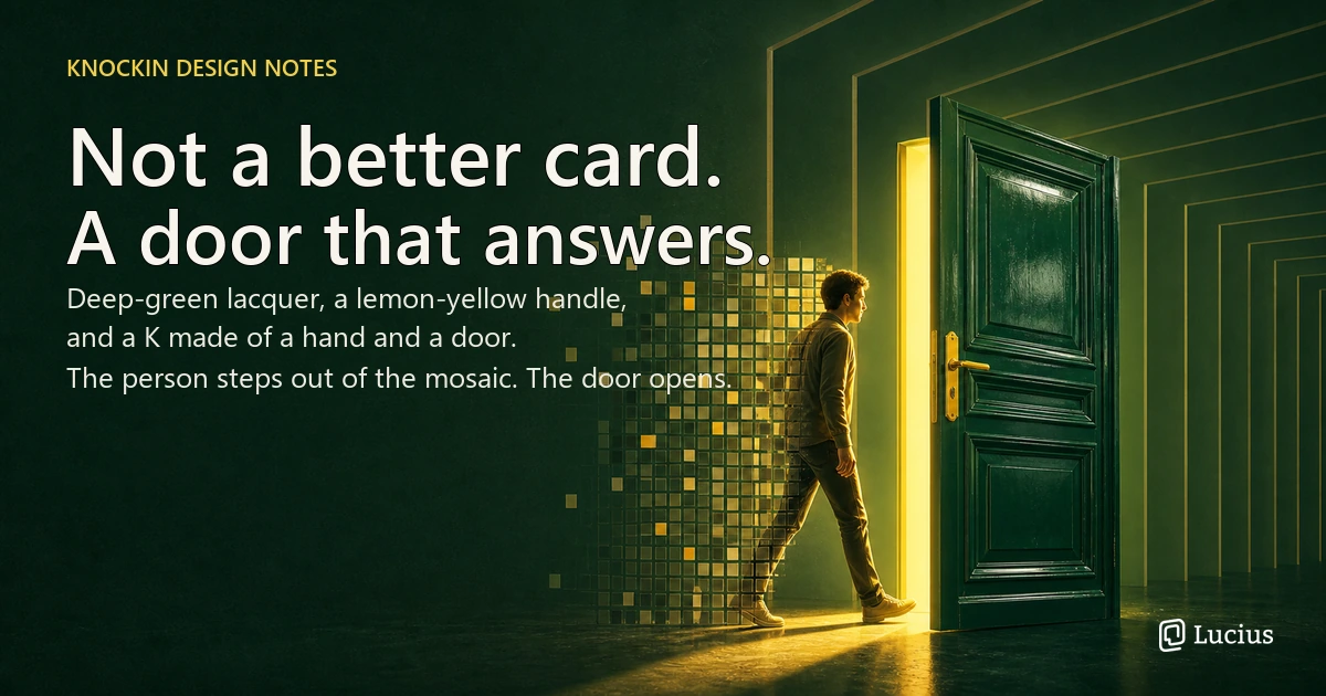
We did not set out to make a better-looking digital business card. We set out to make a door.
A card is a surface you hand someone. A door is something they knock on — and when a door gets knocked on, someone is expected to answer. That difference is the whole product, and it is why Knockin looks the way it does: the name with an apostrophe, a letter K split into a hand and a door, a deep-green card with a lemon-yellow handle, and pixel mosaics that flatten people before a person steps out of them. Every design decision in this article traces back to one claim — your bio should finally answer back — and this is the story of the decisions behind that sentence.
A Card Is a Statement. A Door Is an Invitation.
The insight that started Knockin was not about technology. It was about what a name card has always been, and what it has never once been.
For centuries, the business card has been a statement about a person: their name, their title, their company, their contact details. Hand it over, and the statement is complete. The card performs perfectly — and then it falls silent. Everything after that moment — the follow-up, the explanation, the conversation that actually decides whether two people matter to each other — happens off the card, or not at all. A statement cannot be interrupted, asked a question, or change its mind.
We wanted to build the thing a statement cannot be: an introduction that behaves like an answered door. Think about the metaphor the way we did. A card is your front door — the face you present to someone who has just found you. The AI attached to it is the concierge who answers when a visitor knocks. When someone knocks on your Knockin, they should not land on a static set of facts they have to decode alone. They should meet a digital identity that can converse, ask questions back, and respond on your behalf.
That shift — from surface to door, from statement to invitation — is not a slogan. It is the organizing principle of the brand, and it turned out to have surprisingly concrete consequences for how the name is spelled, how the logo is drawn, which colors we painted, and what those colors are allowed to mean.
Why "Knockin'", with the Apostrophe
The first design decision anyone meets is the name, and the name makes a claim the standard spelling would have quietly reversed.
Knocking — the standard form — describes an action performed on a door by a stranger. It is correct, formal, and slightly cold. We deliberately chose the colloquial knockin' instead: relaxed, younger, closer to the way people actually talk to each other online. Dropping the "g" drops the ceremony. This is not a business card being filed; it is someone leaning on your doorframe saying a friendly "knock, knock."
There is a second layer. A name in the present participle — a word still in motion — says the product is about what is happening now, not a record of who you were. An introduction that answers back is not an archive of a career; it is an ongoing conversation with whoever happens to be at the door at midnight. The apostrophe is the small visible mark of that stance: this brand is comfortable being informal because being informal is how real introductions actually happen.
The choice also set the tone for the work that followed. If we cared enough to argue about a single apostrophe, we were going to care about the shape of a letter, the temperature of a color, and what a mosaic does to a face. Name first; everything else followed the same standard.
A K Made of a Hand and a Door
The logo needed to carry the same story in a single letter, and it had to do it without drawing an actual door.
The mark takes the K in Knockin and splits it into two parts: a sharp angle, and a vertical line. The angle is a hand raised to knock. The line is the edge of the door it knocks on. The two shapes meet the way a knock meets a door — briefly, at the boundary between a person outside and a person inside.
We kept it abstract on purpose. A literal drawing of a door and a hand would have told the story once and then stopped being interesting. Abstraction leaves room: visitors who see the mark for the first time can read it as a letter, a knock, a doorway, or all three, and the ambiguity is the feature. At the same time, the mark had to survive the places where Knockin actually shows up — a favicon, a QR code corner, a wallet pass, a notification — where a fussy illustration would collapse into noise. The test we held ourselves to was simple: clear enough to work as an icon, open enough to carry a story. Once someone tells you the K is a hand and a door, it is very hard to unsee it. That is what we wanted.
Deep-Green Doors and Lemon-Yellow Handles
Color did the emotional work that shape could not, and it started with a door we remembered rather than invented.
Large fields of deep, dark green were the first decision. The color was meant to call up a specific object: a vintage door with a lacquered, glossy finish, fitted with brass handles and quiet metal details. Green this dark reads as solid, established, physical — it gives a digital surface the weight of an actual entrance.
Then we hit the problem the whole palette turns on. Done honestly, brass and bronze make a door feel old — distinguished, maybe, but closer to a bank vault than to the person who wants to introduce themselves at a conference. We did not want classical. We wanted classic enough to feel like a door, and modern enough to feel like someone you could actually talk to. So we translated the bronze: instead of keeping the metal dark, we brightened it into a clear lemon yellow. The yellow keeps everything the metal was for — the contrast of a bright accent against a deep field, the sense of a handle you can reach for — while pulling the whole identity away from heritage and toward something younger, more forward, more willing to be seen.
That yellow is not decoration. It is the part of the door that says the door opens. A deep green door alone reads as "please knock softly." A lemon-yellow handle on that same door reads as "someone is home, and they are glad you came." We wanted the second sentence.
The Flattened, and the One Who Steps Out
This is where the brand stops describing a product and starts describing the person on the other side of the door — and why, at the center of the visual language, people are deliberately flattened before they step out.
Large pixel mosaics and grids run through Knockin's visual identity, and they are not a texture picked for style. They say something we believe: the internet tends to flatten people. A photo compressed into an avatar, a life compressed into tags, a whole person compressed into the three lines of a bio — that is what a mosaic is, a person reduced to squares. The grid is an honest admission of what happens to all of us online, at least until something lets us step out of it.
So the most important image in the identity is the person who steps out of the mosaic. Where the grid is flat, the person is dimensional; where the avatar is pixels, the person is a face. That single gesture is the product in visual form. Knockin exists so that someone who found you through a tag or a link can gradually meet the less flat version of you — your work, your reasoning, your boundaries — instead of stopping at the squares everyone else sees.
The last element ties the visual grammar together. A < angle is drawn out of the K and repeated, stacked into a pattern that reads like code — and, seen differently, like a set of doorframes opening one after another. We chose it because it sits exactly where Knockin sits: the < is both a programming symbol and a doorway, which is to say the brand lives at the junction of three things — knocking, the human ritual; code, the digital medium; and the ongoing conversation that starts once the door opens.
What the Door Owes the Visitor
A metaphor only earns its place if it eventually turns into obligations. Once we said "door," the door told us what a card never had to do — and those obligations became the product's three design principles.
First, a door can be knocked on; a card can only be read. A visitor to a static bio has to invent their own next question. Knockin opens with the invitation built in: quick prompts like "About you" and "Book a meeting," and a "Who's knocking?" entry that makes starting a conversation the default action rather than the puzzle. Second, a door is answered even when the owner is away. The concierge answers around the clock from your Knowledge — the facts, files, and corrections you have given it — so your presence does not depend on your being online. A card describes you at the moment it was printed; a door keeps being answered.
Third — and this is the obligation we care about most — a door that is always open is not a door. The concierge is built to stop. When a visitor asks for something that needs your judgment — a partnership, a hiring decision, a price — the AI does not improvise an answer in your voice. It creates a Task and hands the conversation to you with full context. That boundary is the difference between an AI that represents you and an AI that impersonates you. We say it plainly in our guide to using Knockin: the concierge hosts and informs, but it does not confirm deals or make judgment calls for you. The door is answered quickly, warmly, and honestly — and the person who lives behind it is still the one who decides who comes in.
Conclusion
Knockin is not a traditional business card moved onto the internet. It is a card redesigned from the ground up as a door — one that can be knocked on, that answers when it is knocked on, and that makes the visitor want to step closer rather than file the card away.
That is why the name carries an apostrophe, why the K is a hand meeting a door, why the green door has a lemon-yellow handle, and why the person in the mosaics is always stepping out of them. None of it is ornament. It is a consistent answer to a single question: what should it feel like to meet someone for the first time in the age of AI?
For us, the answer is that meeting someone should feel less like receiving a statement and more like being welcomed in. We built the door. If you want to see what it feels like to knock, your bio can finally answer back — no credit card, a few minutes, and your own concierge waiting behind the door.
Related Posts
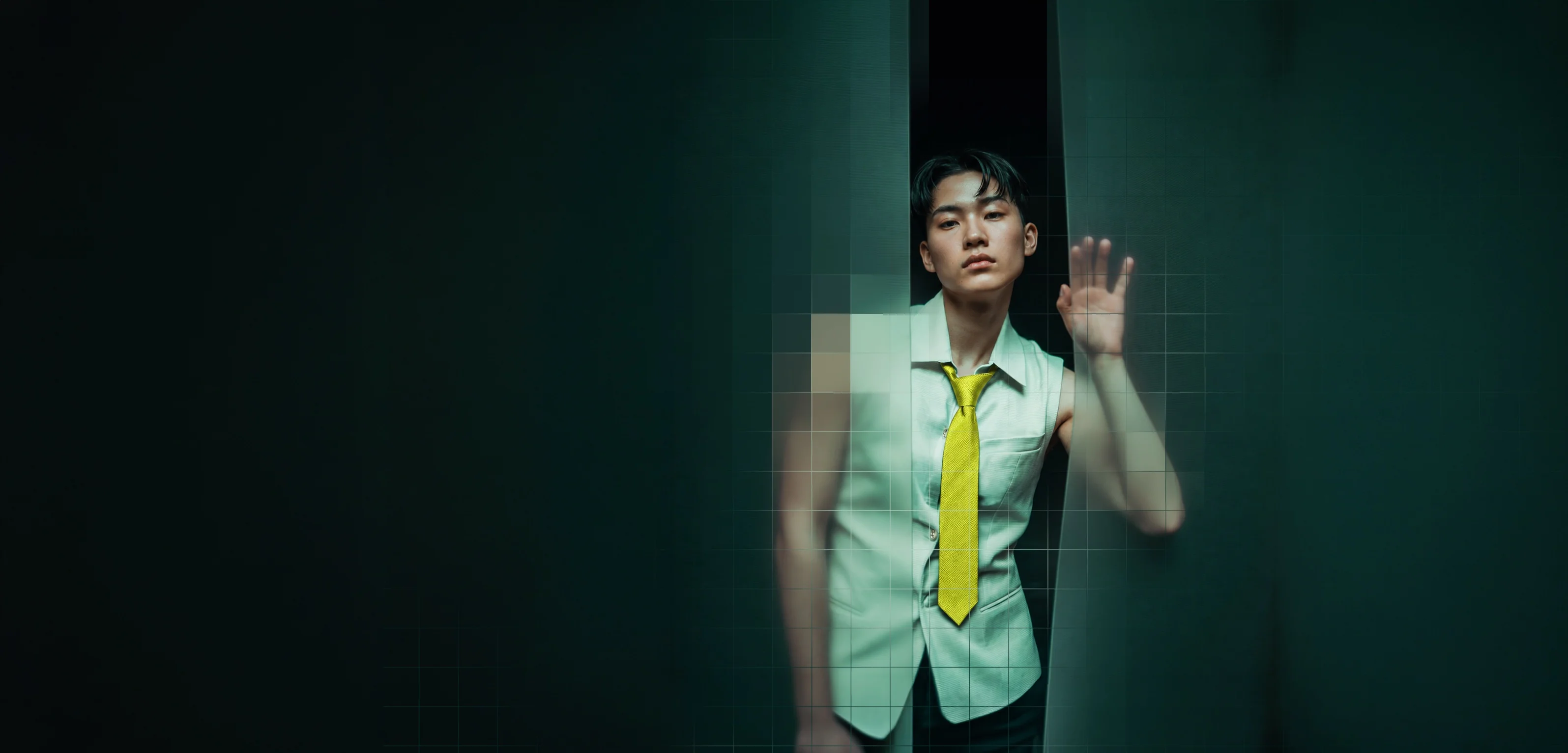
Introducing Knockin: Your Bio Can Finally Answer Back
Knockin turns what you already know into an intelligent bio link that answers questions when you're not there. Build, refine, and share in…
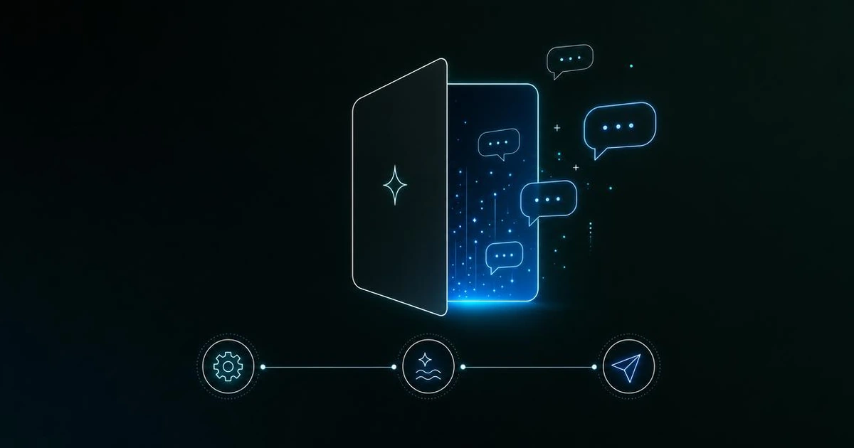
How to Use Knockin: Signup to LIVE Card, Handing Off Correctly
From Knockin signup to a LIVE card: onboarding, Card Editor, Knowledge, publishing, Tasks, and Credits — so your concierge answers until it…
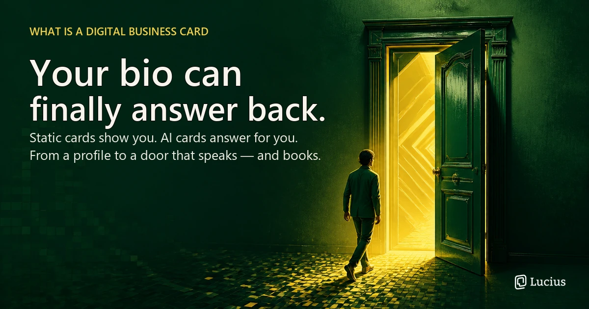
What Is a Digital Business Card: The Card That Answers Back
A live profile shared by link, QR, or NFC — and AI now turns static cards into ones that answer and hand off judgment calls. Here's how the…
Frequently Asked Questions
Is the 'door' framing just branding, or does it change the product?
Why did you spell it “Knockin'” instead of “Knocking”?
What does the K in the Knockin logo stand for?
Why dark green and lemon yellow?
Will the mosaic style pixelate my photos on Knockin?
If my AI answers when I'm away, won't visitors feel spammed?
Knock—and Your Concierge Answers
A bio that answers back: one link, your AI concierge.
Answers warmly, stops at judgment—deals, hires come back.
https://knockin.info/blog/why-knockin-is-a-door